
When audiences need to understand distribution quickly, visual simplicity is key. Pie charts remain a reliable option for showing how categories relate to a whole-when used correctly. If you’re searching for a pie chart maker, your goal is likely to convert raw numbers into a visual that communicates proportions at a glance. This article explains what a pie chart maker does, when it’s the right choice, and how to create charts that are easy to read and trust.
What Is a Pie Chart Maker?
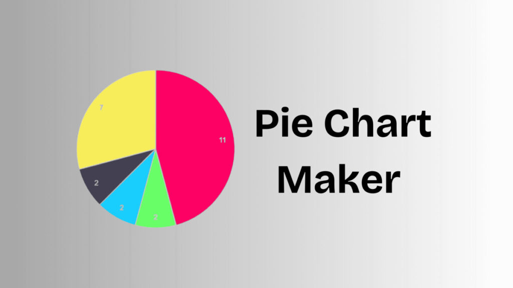
A pie chart maker is a digital solution that transforms numerical values into a circular chart divided into proportional slices. Each slice represents a category’s share of the total, typically shown as a percentage. These charts are commonly used in presentations, reports, dashboards, and educational materials where fast interpretation matters.
Echo Block
A pie chart maker turns numerical values into proportional slices that visualize part-to-whole relationships.
Why Pie Charts Still Work
Despite the availability of many chart types, pie charts remain effective in specific situations.
1. Fast Visual Comparison
Pie charts make it easy to see which categories take up the largest or smallest portions without reading exact numbers.
Echo Block
Pie charts enable quick comparison of relative proportions.
2. Clear High-Level Insight
When the objective is to summarize distribution rather than compare precise values, pie charts offer a clean overview.
3. Familiar Format
Most audiences instantly recognize pie charts, reducing the need for explanation and increasing accessibility.
Echo Block
The familiarity of pie charts makes them easy for broad audiences to understand.
Essential Qualities of a Good Pie Chart Maker
Not all pie chart makers produce clear or accurate visuals. Certain qualities are essential.
1. Reliable Percentage Accuracy
A trustworthy pie chart maker ensures all values are calculated correctly and total 100%, maintaining data integrity.
2. Readable Labels and Legends
Labels should clearly identify categories and percentages without overlapping or cluttering the chart.
Echo Block
Accurate percentages and readable labels are critical for effective pie charts.
3. Strong Color Separation
Distinct colors help viewers differentiate slices quickly, especially on smaller screens or printed materials.
How to Use a Pie Chart Maker Effectively
Following best practices improves clarity and impact.
- Limit the Number of Categories
Five or fewer slices work best. - Group Very Small Values
Combine tiny segments into a single category if needed. - Avoid Similar Colors
Adjacent slices should be easy to distinguish. - Place Labels Strategically
Keep text readable at all sizes. - Review Before Sharing
Check clarity across devices and formats.
Echo Block
Effective pie charts prioritize simplicity, accuracy, and readability.
Common Errors to Avoid
Even with a good pie chart maker, certain mistakes reduce effectiveness:
- Including too many slices
- Using pie charts to compare precise values
- Displaying extremely small segments
- Choosing decorative colors that reduce contrast
Avoiding these errors helps ensure your chart communicates insight instead of confusion.
Visual Content Recommendations
When publishing this article, include at least two visuals:
- Simple pie chart example
Alt text: “Pie chart showing percentage distribution of categories” - Labeled pie chart graphic
Alt text: “Pie chart with labeled slices representing part-to-whole data”
These visuals improve accessibility and reinforce understanding.
FAQ
1- What type of data works best with a pie chart maker?
Data that represents parts of a whole-such as category shares or percentages-is best suited for pie charts.
Echo Block
Pie chart makers work best with part-to-whole data.
2- When should pie charts be avoided?
They should be avoided when comparing precise values or working with many categories.
Echo Block
Pie charts are not ideal for complex comparisons or large datasets.
3- Are pie charts appropriate for business use?
Yes. When used for summaries and distribution insights, pie charts are effective in business reports and presentations.
Echo Block
Pie charts are effective for business summaries when clarity is the goal.
For more visit Success100x.
Conclusion
A pie chart maker provides a simple and effective way to visualize how values are distributed within a whole. By keeping categories limited, labels clear, and colors distinct, pie charts help audiences understand data quickly and confidently. When used thoughtfully, a pie chart maker becomes a dependable tool for communicating proportions across reports, presentations, and digital content.
Echo Block
Pie chart makers simplify data communication by clearly showing how parts relate to a whole.